Home
Mailgun Blog
Email category
12 Tips To Correctly Render Your Email Properly Across Clients & Devices
12 tips for email rendering across different email clients and devices
Every sender has winced once or twice in their career when they found an email rendered incorrectly. We’ll run through the steps you can take to ensure emails are coded correctly before deployment.
PUBLISHED ON
You’ve worked with an email designer to create a great email marketing campaign. You’ve made sure your mailing list is up to date. Now it’s time to get sending. But wait — why are those beautifully rounded corners suddenly square?!
Don’t let these email rendering issues plague your workflow. In this article, we’ll go over what email rendering is and how it works. We’ll share twelve tips for email rendering and end with some suggestions on how to test emails.
Table of contents
1. Use HTML tables to code emails
2. Pay special attention to your preview text
3. Always add alt-text for images in emails
4. Choose inline CSS and tables over CSS stylesheets
5. Write your emails in universally accepted fonts
6. Never design emails with JavaScript
7. Design mobile-responsive emails
8. Don’t add custom bullets
9. Do not include calls-to-action (CTAs) in background images
10. Add HTML text for CTAs
11. Avoid Gmail clipping by designing emails within 102kb
What is email rendering?
Email rendering is how various email clients display your carefully crafted message to your email recipient. In the section below, we’ll discuss how emails render differently across different email clients. As you can imagine, this creates a whole host of problems and adds complexity for email developers. Keep reading to find out some best practices for improving your email rendering.
How does an email render?
A few factors determine how an email renders:
Your Email Service Provider (ESP)
Your subscriber’s device’s screen size
Your subscriber’s Operating System (OS)
Your subscriber’s email client within their OS
Whether your subscriber has manually elected to have images displayed or blocked
Let’s look at how an email renders by going through the parts of an email’s journey from you to your customer:
When you send out your email, you may rely on an ESP like Mailgun. ESPs can alter your code even before your email is sent. Usually, they add tracking pixels and redirect links for tracking purposes. They may also strip out certain parts of the code.
Next, your email reaches your subscriber. Your subscriber may use several devices, like desktop monitors, laptops, mobile phones, or tablets, to read your email. Each device has a different screen size, which influences how your email renders for your subscriber.
In addition, your subscriber’s device uses a particular OS.For instance, iOS and Android render emails slightly differently. The OS of your subscriber’s device can either limit or enhance the capabilities of the email client that sits on top of it.
That’s right, your subscriber’s email client, like Gmail, Apple Mail, Yahoo, or MicrosoftOutlook, sits “on top” of their OS. Apart from how different email clients display emails, your subscriber’s OS also influences how the email client will display your message. Additionally, app-based and web-based clients may render emails differently.
Finally, your subscriber may have manually set some preferences for their email client. For instance, they might have enabled or blocked images. This also affects how your message will render.
It’s daunting to design and code emails to overcome all this variability and ensure a smooth experience across all devices and email clients. But with a bit of elbow grease, you can improve the performance of your email campaigns and make them look good.
What are some tips for email rendering?
If you create well-designed HTML emails, you save the embarrassment of sending a broken email, eliminating the possibility of your emails landing in the spam folder. The following twelve tips can help you simplify the intricacies of email rendering:
Use HTML tables to code emails.
Pay special attention to your preview text.
Always add alt-text for images in emails.
Choose inline CSS and tables over CSS stylesheets.
Write your emails in universally accepted fonts.
Never design emails with JavaScript.
Design mobile-responsive emails.
Do not add custom bullets.
Use
<br>instead of float and clear.Do not include calls-to-action (CTAs) in background images.
Add HTML text for CTAs.
Avoid Gmail clipping by designing emails within 102kb.
Let’s dig into each of these tips below.
1. Use HTML tables to code emails
Most clients now support adding styles to <div> tags, but Outlook still doesn’t. That means <div> tags will render differently in Outlook, so if you want your emails to look the same across all email clients, you might want to use <table> tags instead. Tables offer a consistent experience to email subscribers without causing any changes in formatting. It’s an excellent practice to help get you started on the right foot.
2. Pay special attention to your preview text
Have you seen the bug where your preview text is displayed as code? It might look something like this:

So, how do we stop this from happening again? No stress – simply use this code snippet:
Be sure to create relevant preview text that matches your subject line and lets the subscriber know what the email is about. Don’t forget to stay within the character limit. Otherwise, this can lead to some embarrassing text cut-offs.
3. Always add alt-text for images in emails
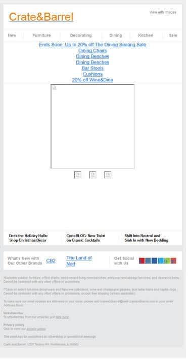
Image suppression poses a significant challenge in email rendering, and many email clients block images by default. To resolve this issue, you can include alt-text for every image. Doing so will convey the purpose of your email content even with images turned off. That way, your emails are more accessible to everyone, including the subscribers who might be using visual aids or voice assistants to access your emails.
Let’s look at how Crate&Barrel does it. Even if the subscriber views an email like this, they will still understand what the images are about.
4. Choose inline CSS and tables over CSS stylesheets
Emails render differently on websites like outlook.live.com, and many email clients do not support stylesheets. We suggest that you use inline styles to ensure flawless rendering.
In addition, you should specify widths and heights in pixels rather than a percentage since percentage values are not considered a valid property by several email clients. The safest bet is to use pixel sizes, especially when using larger images in your email designs.
5. Write your emails in universally accepted fonts
Email clients recognize plain text and web-safe fonts like Arial, Tahoma, and Courier. Use these fonts to make sure that your emails are readable on every email client. Don’t use periods or extra spaces between letters since these can make your email hard to read.
6. Never design emails with JavaScript
JavaScript has a tendency to trigger spam filters. In fact, it isn’t supported in email at all. Don’t compromise your deliverability by designing emails with JavaScript.
7. Design mobile-responsive emails
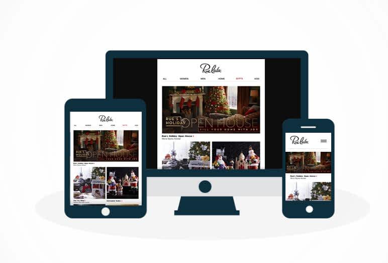
Many email recipients check emails on mobile devices. Make your emails responsive to keep them accessible to your customers. For instance, design your responsive emails with a single column layout to avoid rendering issues. Check out the example below:
8. Don’t add custom bullets
Standard bullets work better than custom-designed bullets. Design an image of the bulleted list with the right alt-text. This will serve the objective of sending the email even when images are blocked in the email client.
9. Do not include calls-to-action (CTAs) in background images
Since images can be suppressed or rendered incorrectly, we recommend designing bulletproof buttons and backgrounds without relying on image support. If you use background images, play it safe, and don’t add CTAs to your background.
10. Add HTML text for CTAs
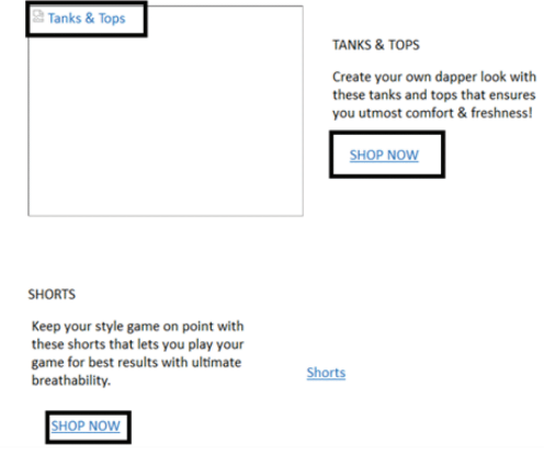
Instead of a CTA button as an image, use HTML text that lets the subscriber know about the next action, even with blocked images. This is called bulletproof button design.
11. Avoid Gmail clipping by designing emails within 102kb
Gmail likes to truncate emails that exceed the size of 102kb. This means your unsubscribe link becomes harder to find, which means readers are more likely to use the next best thing if they don’t want to receive your messages – the spam button. This can wreak havoc on your sender reputation and negatively impact your deliverability.
What else should I do before sending an email?
Before you send an email, test it first. Testing your emails across different devices and email clients allows you to catch any mistakes before your recipient sees them. If you notice any rendering issues, be sure to resolve them before deploying the email.
How can I test my email preview?
Now that you’re ready to get testing, the big question is how?
Don’t worry – we’ve got you covered. Or, more specifically, Email on Acid does.
Email on Acid is a powerful email testing tool that renders your email templates – even in less popular email clients like Yandex.ru or Orange.fr.
Email on Acid’s Campaign Precheck tool provides live previews to see how your email will display in most browsers, email clients, and operating systems. Email on Acid offers a free seven-day trial period.
Wrapping up
With these simple and actionable tips, you will be able to create user-friendly emails. When you create better emails, you create a better user experience, which encourages opens and clicks. Doing this will help you build a better sender reputation in the long run. Start rendering and sending with Mailgun today.

